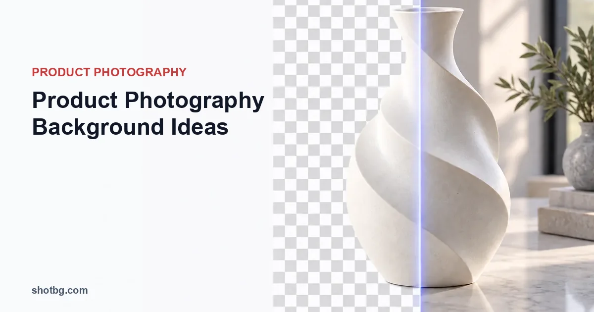
Choose a product-photography background according to what the image must show: white for a simple catalog field, gray for pale edges, dark for deliberate highlights, and a real surface when texture or context helps explain use. Check the product's material before choosing the color. A background affects reflections and translucency as well as the empty space around an object.
Match the background to the product's hardest surface
| Background | Useful application | Main problem to check |
|---|---|---|
| Matte white | Dark, opaque products and plain catalog images | Pale edges and highlights can disappear |
| Neutral gray | White packaging, clear contours and color-reference views | Not interchangeable with a channel that requires white |
| Matte dark | Light ceramics and controlled reflective-product shots | Dust and light edge fringes become conspicuous |
| Paper sweep | Seamless tabletop-to-backdrop transition | Creases and a visible bend can distract |
| Wood or stone | Products whose use involves a real surface | Color spill, false scale cues and busy grain |
| Fabric | Soft-goods or editorial arrangements | Wrinkles and moiré can compete with the product |
| Generated studio scene | An illustrative variation on an existing product photo | Perspective, contact, reflections and product integrity |
Do not select the background in isolation. A dark bottle on charcoal may need a side highlight to reveal its shoulders, while a white ceramic mug on white may need a gray edge reflection or a separate background exposure.
Three practical starting setups
A matte sweep for an opaque catalog product
Curve a sheet of paper from the surface up behind the object without a sharp fold. Move the product away from the curve if its shadow outlines the bend. Light the product first, then assess the empty field: making the background brighter by overexposing everything can erase a pale label.
If a solid white deliverable is needed afterward, use the white background generator and inspect the silhouette. White pixels outside the object should not come at the expense of white pixels that belong to it.
Gray with cards for a pale or glossy object
Place a neutral gray surface behind the product. Move white and black cards outside the camera's frame until the reflected bands define the contour. For glass, inspect what appears through the object as well as around it. A gray background viewed through a clear vessel remains part of the captured appearance.
Use the eyewear photography guide for a concrete example of why transparent lenses cannot always be treated as ordinary opaque cutouts.
A real surface for context
Choose a surface with an appropriate physical scale. Large wood grain behind a tiny object can make the object appear miniature; coarse stone beneath delicate packaging can introduce unintended size cues. Keep the product level and show believable contact with the surface.
For a top-down composition, the flat-lay guide covers alignment and shadow overlap. If texture makes a small label harder to read, simplify the surface rather than adding more contrast to the label.
ShotBG removes backgrounds in seconds with AI. Free for your first image — no signup required.
Judge a replacement against the original photograph
ShotBG can remove the background and replace it with a studio setting; Pro supports text-described custom backgrounds. Start with a source angle and light direction that suit the intended scene. A background change does not rotate the photographed product or reveal its hidden underside.
Inspect the floor contact, cast-shadow direction, horizon and reflections. A glossy bottle may still reflect the room in which it was photographed. A new background outside its contour does not automatically replace those reflections or the old color seen through transparent material.
Keep channel requirements separate from visual taste
A stylish background is not automatically suitable for the main image on every marketplace. Check the Amazon image requirements guide when preparing that deliverable. Keep neutral documentation images for color, contents and condition even if the campaign uses textured or generated scenes.
Choose the simplest background that preserves the product information needed in that image. If changing the scene makes an edge, label or included part harder to understand, the variation is not serving its purpose.

